Boutique brands are usually born with strong visual character. Think custom lettering, intricate symbols, hand-drawn marks, or references that only a specific audience fully understands. That’s the point. A boutique brand doesn’t want to appeal to everyone. It wants to speak clearly to someone.But growth changes the rules.When a fashion label moves from local cult favorite to international player, its logo suddenly has to do a lot more work. It must look good on a website header and a tiny clothing tag, on oversized hoodies and minimalist packaging, on Instagram and on a billboard in another country. It must work in monochrome, embroidery, print, digital animations, and collaborations.And here’s the uncomfortable truth: many boutique logos simply aren’t built for that level of flexibility.
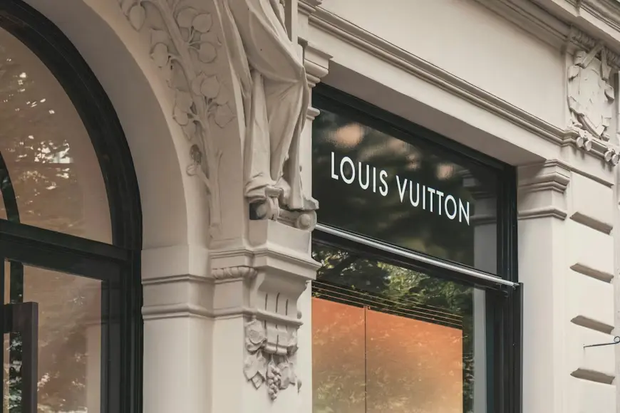
Saint Laurent dropped its ornate YSL-inspired aesthetic and moved toward a stark, sans serif wordmark. Céline famously transformed into CELINE, removing the accent and embracing clean, geometric typography. Balenciaga followed a similar path with a stripped-down, modern typographic logo.At first glance, these changes felt almost shocking. Critics called them boring, soulless, corporate. But there was a deeper logic behind them.Once a company has established itself as an international giant, the move toward plain typography starts to make sense. These brands are no longer trying to signal exclusivity to a narrow group. They are too big to brand in the traditional sense.It goes back to the idea that by trying to communicate with everyone, you communicate with no one. Brands are designed around a target group. International brands, in many ways, no longer have a single target group. Their audience is fragmented across cultures, languages, and markets.Minimalist, sans serif typography becomes a kind of neutral visual language. It doesn’t strongly exclude anyone. It also sits more comfortably alongside non-Latin scripts, whether it’s Arabic, Chinese, or Cyrillic, without feeling visually disjointed. In a global market, that matters more than nostalgia.
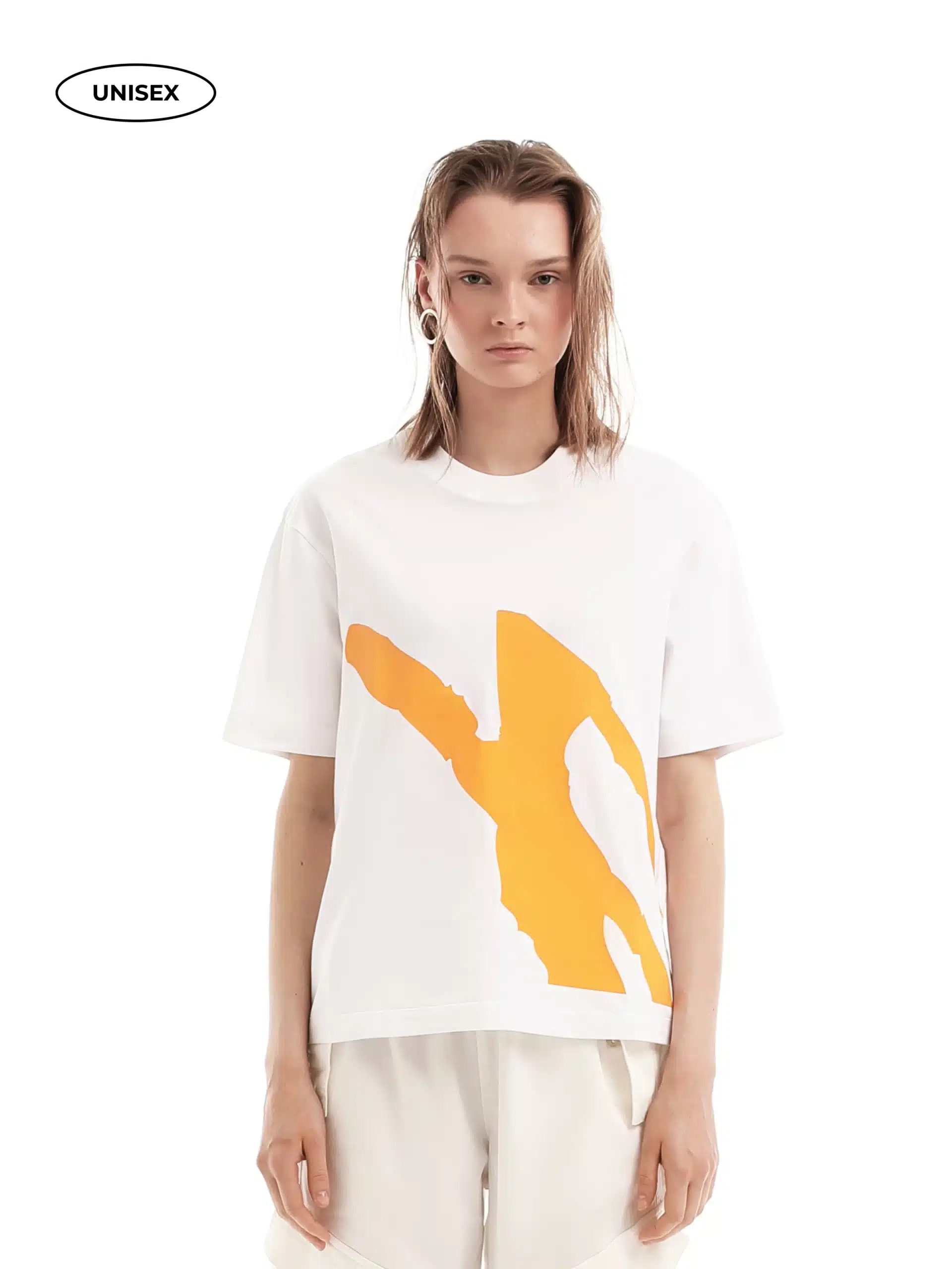
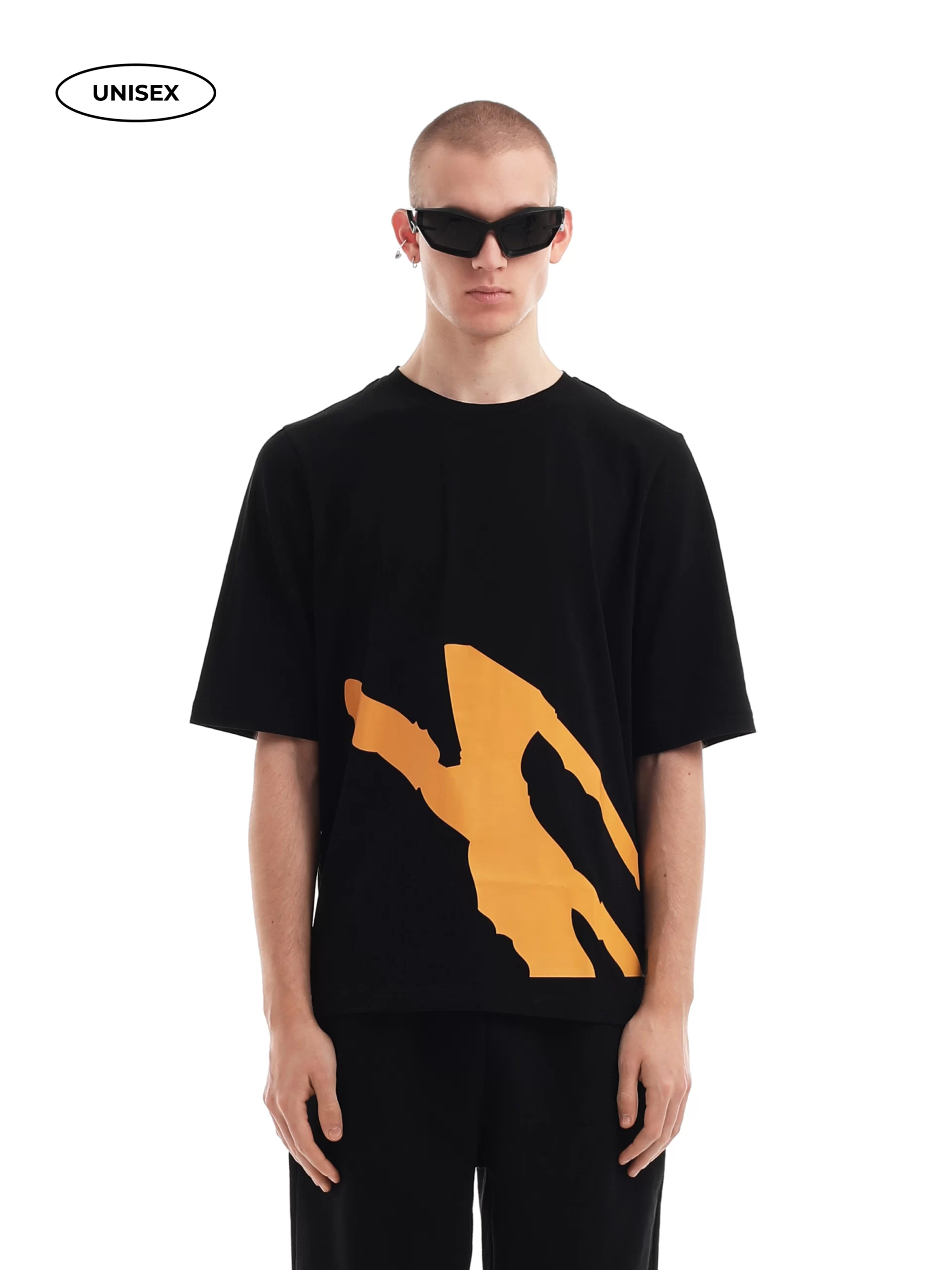
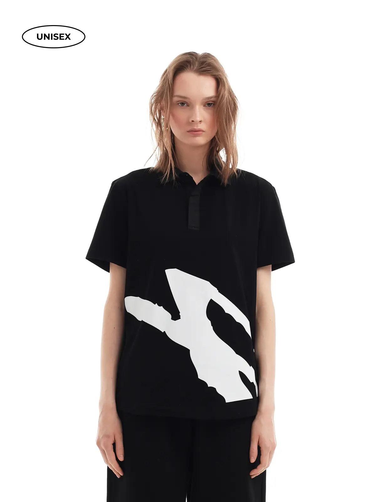
For fashion brands, logo redesign isn’t just a visual exercise. It directly affects branded merch, especially clothing.A complex logo might look beautiful on a website, but how does it translate to:
Minimalist logos often win here. Simple wordmarks are easier to scale, cheaper to produce, and more versatile across materials. They also align with current fashion trends where subtle branding often feels more premium than loud graphics.At the same time, there’s a risk. When every brand adopts the same visual language, clothing starts to look interchangeable. Walk into any streetwear store and you’ll see rows of hoodies with similar sans serif logos. From a distance, it’s hard to tell brands apart.That’s the paradox: redesigning a logo can make a brand more scalable, but also less distinctive.
When a boutique brand changes its logo, it’s rarely just about aesthetics. It usually signals something bigger.Sometimes this means that the brand is moving into a new phase, with new markets, new product categories, and new prices. A polished logo can give off an air of maturity and confidence.Sometimes it shows change within. Visual updates often come with new leadership, a new creative direction, or a change in brand values.A logo becomes a public marker of transformation.But redesigns can also expose problems.If a brand changes its logo too often, it can signal insecurity or lack of direction. Customers may feel disconnected from the brand they once loved. Loyal fans might interpret the redesign as abandonment of the original identity that drew them in.
In fashion especially, where emotional connection and storytelling matter, that can be dangerous.
There’s no universal timeline, but there are some clear signs that a logo redesign might be justified.One is practical limitation. If your logo consistently fails across applications—if it’s unreadable on clothing tags, impossible to embroider, or visually messy in digital environments—it may be time to rethink it.Another sign is the scale. When your brand starts making a lot of branded merchandise, moving into new areas, or working with partners from other countries, your logo needs to be more than just a design element. It needs to be a universal symbol.
Not every urge to redesign a logo is strategic. Sometimes it’s just boredom.A common mistake is changing a logo because it feels outdated to the founder or creative team, while customers still strongly identify with it. In fashion, familiarity can be an asset. A logo that feels “old” internally might feel iconic externally.Another bad reason is trend-chasing. Minimalist typography is popular now, but trends change. If you redesign your logo purely to match what other brands are doing, you risk losing your identity without gaining long-term relevance.Finally, changing a logo without a bigger brand strategy is dangerous. A new logo won’t help if your positioning is unclear, your storytelling is weak, or the quality of your products inconsistent. If anything, it can highlight those weaknesses.
For boutique fashion brands, logo redesign is a balancing act between growth and identity.On one side, there’s the need to scale: to simplify, standardize, and globalize visual language so it works on clothing, packaging, digital platforms, and international markets. On the other side, there’s the risk of becoming visually generic, blending into a sea of similar wordmarks and minimalist aesthetics.The most successful brands don’t treat logo redesign as erasure. They treat it as translation. They find ways to preserve their core identity while adapting it to new contexts.