Graphic design has always been influenced by cultural moods, political climates, and the technologies available at the time. Designers in the world of design followed two opposing design methods because they either made beautiful, harmonious designs or used disordered and harsh elements.
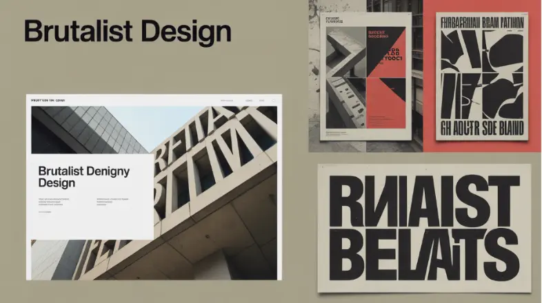
The harsh type of design movement known as Brutalist graphic design stands out as one of the most attention-grabbing styles in all categories. This style presents itself through raw textures and structural elements and harsh typography, and a purposeful rejection of traditional beauty standards.
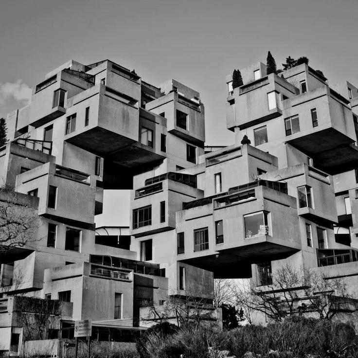
The Brutalist graphic design style obtained its name and design principles from the architectural movement that appeared in the middle of the 20th century. The world still contains numerous brutalist architectural relics, which include several prominent buildings that represent the brutalist style. The Boston City Hall and the Barbican Centre in London, and the Habitat 67 housing complex in Montreal, Canada, represent some of the most notable examples of brutalist architecture.
This article will guide you through the complete history of Brutalist graphic design and its modern resurgence while explaining why this aggressive design style appeals to artists and viewers.
At its core, Brutalist graphic design is about removing polish and revealing the raw structure of design itself. The visual communication sector uses Brutalist graphic design principles, which come from Brutalist architecture. The image above showing brutal architecture is from the Habitat 67 housing complex in Montreal, Canada. The Brutalist architectural design elements in graphic design show their structures through displayed grids, mismatched typography, and discordant color combinations. System fonts such as Arial, Courier, and Times New Roman represent the design choice for this approach because they don’t look like decorative or customized typefaces.
The architectural duo Alison and Peter Smithson promoted brutalist architecture through their advocacy for concrete structures that displayed both structural integrity and unprocessed building materials. The aggressive design techniques of Brutalist architecture create disruption, yet its minimalism brings interest in it through its organized structure. Brutalism allows those people who dislike standard design they experience a genuine opportunity to design freely because it ignores all standard design principles.
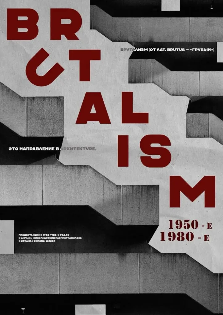
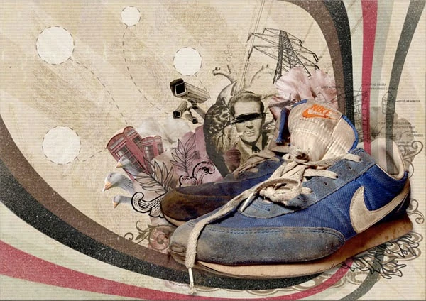
Architect Le Corbusier used the French term béton brut to describe the unprocessed concrete aesthetic of his buildings after World War II. During the 1950s and 60s, Alison and Peter Smithson and Ernő Goldfinger, and Paul Rudolph implemented Brutalist architectural principles, which focused on functional design and honest construction while emphasizing large-scale monumental forms. In the 1972 Munich Olympics, Designer Otl Aicher made bold and geometric posters, using unconventional layouts and vibrant colors to represent the different Olympic disciplines. Brutalist graphic design came up as an aesthetic movement during the final years of the 1990s and the initial years of the 2000s, when the internet was expanding. The sportswear company Adidas also used this in its iconic logo, with its three bold stripes and contrasting black and white colors.
Websites from the early days of coding appeared raw through contemporary standards because they used flashing colors with unrefined layouts with plain typography. Although the random selection of those colors eventually became a purposeful design strategy later, users began to implement it on purpose. Pascal Deville initiated the 2014 Brutalist Website project, which established this design movement through his collection of examples that opposed the standardized templates used in corporate digital platforms.
The current design world admires brutalist graphic design through its presence in websites as well as posters and editorial layouts, and brand campaigns. Designers use tools like Photoshop and Figma to create these bold designs. The design style exists mainly in experimental and cultural environments, yet it has started to impact fashion brands and media organizations, which want to present themselves as unconventional. The core value of Brutalist graphic design exists in its commitment to honesty because it presents design in its unadorned state while challenging viewers to experience it directly.
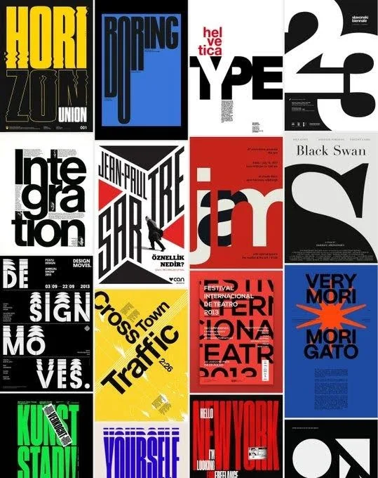
Brutalist graphic design presents itself through specific design elements that create an instant visual impact. The design elements that some people find unappealing actually create the bold and honest appearance of Brutalist design.
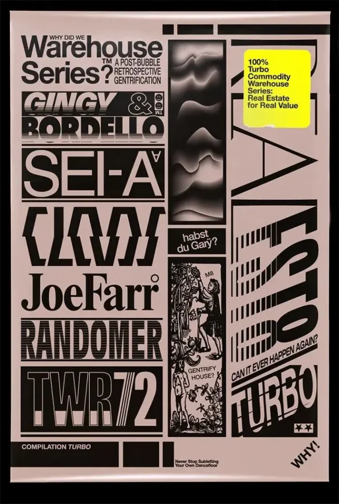
Brutalist design achieves its strength through its distinctive text presentation methods. Designers frequently select basic typefaces, including Arial and Courier, and premium design elements. The text elements in Brutalist design appear large and stretched while placed in abnormal positions, with designers frequently using basic typefaces like Times New Roman and many others in their projects. The default computer fonts that we commonly use in designs often feel rough and create a sense of visual discomfort. Just because the design isn’t polished, viewers focus directly on the words instead of being distracted by decorative elements. Brutalism places content value above visual appeal, which makes it appealing to designers.
Brutalist designers select their colors from two distinct color schemes for their work. Designers who choose to work with minimal color schemes select black, white, and gray, which produces an unrefined appearance. The other design approach in brutalism involves selecting neon colors, which create a visually painful viewing experience. These two design approaches share a common goal to create work that demands immediate attention from viewers. The selection of such blunt colors creates a disruptive effect that prevents the design from being easily forgotten
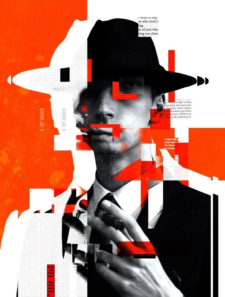
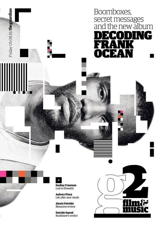
The visual elements in Brutalist design projects avoid any form of polish or smoothness. Designers intentionally use pixelated images together with distorted photos and poorly cropped visuals to achieve their design goals. The designers deliberately show the authentic nature of their design through this approach. Brutalist design reveals its imperfections instead of concealing them. They say that the use of blurry images and rough textures, and broken visual effects in design creates an honest impression to remember, which shows that perfect design is not necessary for effective communication.
Most design elements follow grid systems and balanced arrangements to create organized and readable compositions. Brutalism operates with an opposing design approach. The design structure of Brutalism breaks all rules by allowing text to overlap images and creating irregular spacing and unbalanced visual elements. The initial confusion from this design approach serves its purpose because it forces viewers to pause and examine the content twice before understanding its meaning. This disorderly arrangement of elements transforms it into the defining characteristic of this design style.
Brutalist design exists to deliver messages rather than create visual appeal. A design in this style presents information directly to the viewer through unappealing methods. The visual appearance of a poster might be unappealing, yet its powerful message will grab everyone’s attention. The website design may appear unpolished, yet it effectively directs users to their needed information. The design presents its message directly to your face through methods that might cause discomfort. This direct approach of this design attracts artists because of its straightforward nature. Brutalism eliminates all nonessential elements to achieve its core function of communication.
David Rudnick – Known for bold, experimental typography and futuristic yet raw layouts that challenge traditional design rules. This image is from nostalgic album sleeves and posters for Turbo Recordings. Rudnick’s posters, album covers, and event graphics often feature oversized type, distorted lettering, and unconventional color schemes that feel both futuristic and chaotic.
Spoon Graphic (Chris Spooner) – Popular for teaching Brutalist and “ugly design” concepts through tutorials, making the style accessible to new designers. His work covers multiple design styles; his tutorials and resources on rough textures, oversized type, and disruptive layouts have inspired many to experiment with Brutalism.
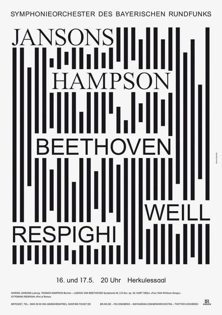
Bureau Borsche – Based in Germany, Bureau Borsche has a design studio widely recognized for its experimental approach to branding and editorial design. This image is an Instant classic, Bureau Borsche’s typographic posters for BR Symphonieorchestra. He is famous for edgy typography, branding, and web projects that mix minimal structure with chaotic Brutalist elements.
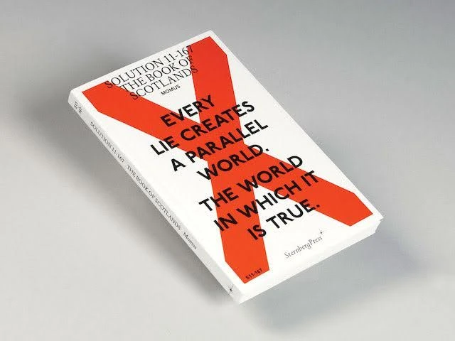
Zak Group – Zak Group has a London-based studio that works heavily within the art, fashion, and cultural industries. The image is the Solution Series, an ongoing collaboration with the editor and writers. Zak Group developed a graphic strategy recognized for cultural and art-related design projects that embrace asymmetry, bold fonts, and disruptive composition.
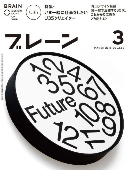
Experimental Jetset – A Dutch artist collective blending simplicity with anti-aesthetic layouts, often using monochrome and stripped visuals, typography. The image is BRAIN’s latest edition that has been launched, and the cover design is by Experimental Jetset. They have been at the forefront of conceptual graphic design since the late 1990s
OK-RM (Oliver Knight & Rory McGrath) – London-based duo creating striking work for galleries and publishers using raw typography and stark contrasts. This image is from Real Review, it is an award-winning quarterly magazine that has collaborated with Ok RM. Many of their projects are produced for galleries and cultural institutions, where their designs strip away polish in favor of bold visual statements.
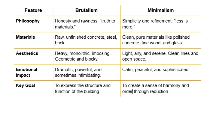
These two architectural styles present architectural design approaches, although they share some common characteristics. Brutalism & Minimalism styles eliminate decorative elements, making functionality their primary design priority. These two design approaches follow different philosophical paths that become evident through deeper analysis. Let’s have a look.
Brutalist graphic design has grown from underground posters and niche websites into a mainstream style. Now in this time, almost every artist is using it in digital branding and in advertising. Nemanja Janjic, from Tunel Studio, says: “I find brutalism engaging because it challenges conventional aesthetics.
In short, Brutalism is not only ugliness now it has also become a language of honesty and forcing people to focus on attractive raw content. Whether in a digital interface, a campaign poster, or an album cover, brutalist graphics continue to provoke, disrupt, and challenge simple designs. That’s how we define it as a good design.
Web and Digital Interfaces – Raw websites with oversized text, clashing colors, and broken layouts; often used by artists and studios to stand out.
Women frequently use flowy drop crotch pants at music festivals. The lightweight materials of rayon or cotton ensure both breathability and fashionable design.
The process of building Brutalist design requires a particular attitude instead of following a set of rigid rules. The core objective of this design approach consists of delivering straightforward messages through unpolished content. The following basic guidelines will help you practice this design style.
The design process described will help you develop raw and honest designs that differ from all other designs in existence.
Brutalist graphic design will continue to exist as a forceful anti-establishment movement in the future. Web design has become the main platform for Neo-Brutalism to flourish because its unrefined appearance actively fights against the current trend of minimalist interfaces that have become overly polished. The design trend emerges from people seeking genuine expression and companies and designers who want to differentiate themselves from others. The imperfect human touch of Brutalism has gained greater value because AI produces flawless yet emotionless designs. The style will persist as a distinctive minority aesthetic that continues to demonstrate that genuine design elements and operational functionality surpass the need for perfect presentation.
Brutalist graphic design exists as a permanent design philosophy that actively fights against perfect appearances through unfiltered, authentic visual expression. This style accepts what others view as unattractive design elements through its use of unbalanced arrangements and harsh visual arrangements. The style rejects traditional beauty standards because it delivers unvarnished honesty through its design approach.
The distinctive elements of Brutalist graphic design include its rejection of conventional design principles through its use of exposed grids and bold typography, and restricted color schemes.
The most famous Brutalist designers include Peter Chadwick and the designers who created the white album cover.
Brutalist design receives criticism for its unattractive appearance because it actively fights against traditional beauty standards through its use of unbalanced compositions and rough textures, and unfinished elements.
Brutalist design will remain as a design trend in 2025 because people seek genuine human-made designs that oppose AI-generated content.
The process of creating Brutalist designs within Photoshop and Figma requires designers to implement three essential elements: strong grid structures and large typography and restricted color schemes, and minimal image and texture application.