Color serves as a tool that sends messages beyond its role as a decorative element. Color theory determines how we experience beauty & emotion and how it affects our perception of identity and balance through both runway collections and fine art paintings. The ability to understand color interactions enables designers, artists and regular people to select visual elements with assurance. The selection of colors in fashion goes beyond picking aesthetically pleasing options. The design principle creates strong effects which determine how people view style, their emotional reactions, brand recognition and future design patterns. The way fashion communicates through color extends from Paris haute couture shows to the way people express themselves through their street fashion choices.
The following guide explains color theory through its historical development, artistic and fashion applications while presenting its essential principles and demonstrating how designers and artists use color psychology to develop effective visual designs.
Color theory functions as a systematic approach that explains how colors interact with human vision and shows methods to achieve visual harmony through color combination. The system unites artistic principles with visual psychological effects and optical scientific knowledge to assist creators in creating harmonious color arrangements which produce contrast and meaningful visual effects.
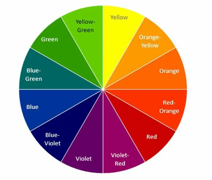
The color wheel serves as the fundamental element of color theory because it presents a circular structure which demonstrates how different colors connect to each other. The system that Isaac Newton created and artist Johannes Itten used to develop into their final creative guide.
Now we will check how color theory works through three main components:
The visual organization of these elements follows the colour wheel structure which enables designers to identify how different elements create contrast and achieve balance and harmony.
The apparel color wheel represents a functional version of traditional color systems which fashion designers use in their work. The tool enables users to detect existing connections between different elements.
The complementary color wheel shows opposite colors which artists use to create bold energetic designs through their artwork and clothing designs.
Color theory serves more than aesthetic purposes because it studies how colors affect human psychology. The human brain links particular wavelengths to create different emotional responses.
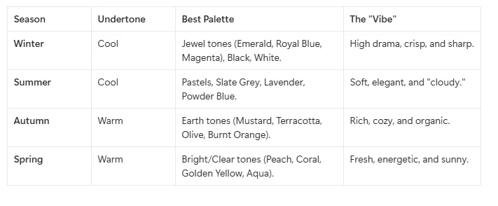
The analysis of skin undertones through color theory enables people to identify whether their skin has warm or cool or neutral undertones which helps them choose appropriate clothing.
Through art, fashion theory connects physical objects to psychological states by using the human body as a canvas and color theory fashion principles create both visual harmony or emotional storytelling. The connection between clothing and art stems from the idea that clothing functions as a communication tool which uses color wheel geometric patterns to guide viewer attention while shaping their visual understanding. The development of Surrealism and Art Deco as art movements created specific designs for clothing shapes and color schemes which modern fashion research applies “Color Science” to study how pigments affect natural light and human skin appearance. The application of artistic principles such as chiaroscuro and simultaneous contrast to textile design enables fashion to transform clothing into applied art which displays the social, political and cultural aspects of a particular time period.
The path to becoming a color theory fashion expert requires you to transcend your understanding of color aesthetics in art because you need to determine which colors suit your personal appearance. The system known as Personal Color Analysis (PCA) uses light science and skin chemical properties to identify your natural color palette which they call your “harmonic palette.” The following section explains how to interpret your individual color theory for skin tone results.
The process of discovering your colors involves studying three particular physical characteristics which include Undertone, Value and Contrast.
This stands as the essential element which needs to be addressed. Your skin surface color (overtone) will shift between tan and red but your undertone remains constant throughout your life.
The term describes the total amount of light or darkness which appears in your facial features.
Your appearance reaches its maximum extent at this point.
You can begin without needing any professional qualifications. You can perform “The Drape Test” to observe color theory fashion principles through facial application.
These books serve as the definitive reference materials for fashion professionals who need to understand art and color theory.
The fundamental research investigates how surrounding environments affect color perception by showing that one color can appear as two distinct shades. Albers uses complex exercises to show students that color exists as a flexible substance which differs from its traditional definition as a fixed quantity. The process of understanding how light and surrounding fabrics affect the way a garment looks requires knowledge of this principle.
Itten who was a Bauhaus master established the seven color contrast methods which included the essential distinction between warm and cool temperature colors. His scientific research established the foundation which modern seasonal color analysis and objective color harmony systems use today. The color wheel structure guide serves as the most effective resource for people who want to learn about color wheel structural principles.
This modern guide presents complex information about pigments, light and value through its contemporary visual approach which makes it easy for artists to understand. Mollica demonstrates how to create meaningful color combinations which remain vibrant through his explanation of scientific theory application in practice. The platform serves as an excellent foundation for fashion designers who aim to apply paint principles to select appropriate textile dyes.
St. Clair examines the historical development of 75 different shades through his analysis of pigments which included “Imperial Purple” and “Scheele’s Green” to understand their impact on human society. The book explores color meanings which extend past visual appeal to present historical, cultural, political and social information about particular colors. The book provides essential knowledge for stylists who aim to use color as a storytelling tool to create particular time periods.
A Japanese costume designer collected these color combinations in the 1930s to create this popular book which contains 348 different sensual color combinations. The presentation method omits extensive lecturing because it shows “color chords” which unite Japanese artistic elements with Western design elements. This resource provides the most complete collection of unique high-end color options which designers can use to create their upcoming fashion collections.
Color theory functions as a creative artistic language which unites artistic expression with fashion design, psychological effects and visual communication methods. The proper application of this concept enables artists and designers to create purposeful decisions which strengthen both the emotional value and visual equilibrium of their work. The process of learning color theory principles enables artists to develop their creative skills through palette experimentation and personal style development. Color achieves its full potential when theoretical knowledge meets practical application because it transforms into a tool which people can understand and apply effectively.
Color theory functions through the establishment of color relationships which include complementary and analogous and triadic schemes that use the color wheel and human visual processing.
Artists apply color theory to create their compositions through the use of hue, value and saturation which helps them establish mood and depth and direct viewer attention.
The study of color theory requires students to learn basic principles while they observe natural color combinations, evaluate artistic works and develop their skills through work with various color schemes and artistic materials.
The first step to understanding requires you to determine your skin undertone between warm gold tones and cool silver tones before selecting your seasonal match from the color wheel. The process enables you to use this theory and fashion principles for choosing colors which will make your skin tone and eye color appear more attractive.